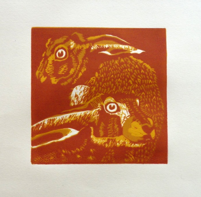
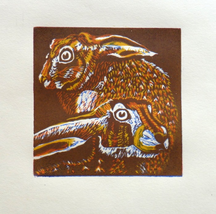
I printed the fourth layer of my reduction print at the Workshop a few days ago. Having initially thought of printing a darker brown, I thought printing in a blue might give a more lively result. So I mixed ultramarine with a little extender and did a test print which I thought worked well. I printed one with just the blue to show the effect it had on the previous layers. There are only small glimpses of blue in the print, but the way it modifies the other colours is exactly what I was looking for.
Only another two layers to go I think. A dark to emphasise the eyes, tips of the ears and shadows, leaving most of the print unaffected. The final layer will be the background, which I plan to do in a contrasting, probably lighter colour. As yet I have no firm idea of what colour that will be, but after living with the next layer for a while I'm sure I will come up with a suitable solution.
Only another two layers to go I think. A dark to emphasise the eyes, tips of the ears and shadows, leaving most of the print unaffected. The final layer will be the background, which I plan to do in a contrasting, probably lighter colour. As yet I have no firm idea of what colour that will be, but after living with the next layer for a while I'm sure I will come up with a suitable solution.

 RSS Feed